
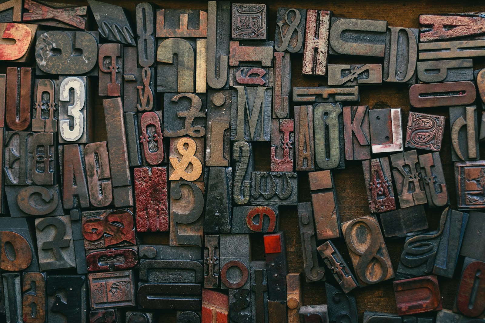
When we think of design, we often think of color, layout, or imagery. But typography—the fonts we choose and how we use them—plays an equally powerful role in shaping perception. Whether you’re building a brand, designing a website, or creating a political campaign sign, the font you choose can make or break the message. At KSL Graphics, we understand how the psychology of typography drives communication, and we’re here to help you choose fonts that speak volumes.
What Is Typography Psychology?
Typography psychology is the study of how fonts influence human emotions, behavior, and perception. Just like color, font choice triggers subconscious reactions. A playful script font might feel approachable, while a bold sans serif screams confidence and clarity. Every font has a “personality,” and aligning that personality with your message is what makes great design feel effortless.
Serif vs. Sans Serif: A Tale of Two Traditions
Let’s start with the basics:
-
Serif Fonts (like Times New Roman or Georgia) are traditional, trustworthy, and classic. They evoke a sense of reliability and authority, which is why you’ll often see them in legal documents or print newspapers.
-
Sans Serif Fonts (like Helvetica or Open Sans) are modern, clean, and minimal. They’re commonly used in tech, startups, and digital platforms for their sleek and approachable look.
Pro Tip: If you’re designing for a modern brand or digital interface, sans serif is often the safer bet. If you want to project timelessness or academic credibility, serif might be your friend.
Emotional Associations of Font Styles
Fonts aren’t just about looks—they evoke emotions. Here are a few examples:
-
Script Fonts – Elegant, romantic, or friendly (think wedding invitations or luxury branding).
-
Display Fonts – Bold and expressive, great for headlines or attention-grabbing promotions.
-
Monospaced Fonts – Technical and minimal, often used for code or niche design aesthetics.
-
Handwritten Fonts – Personal and artistic, often used to evoke a casual, human touch.
Choosing the wrong font can send mixed signals. Imagine using a whimsical handwritten font for a law firm—your message might come off as unprofessional or unserious.
Hierarchy and Readability Matter
Psychology isn’t just about font style—it’s about structure. Effective typography uses hierarchy (like headings, subheadings, and body text) to guide the viewer’s eye and reduce cognitive load. Clear hierarchy increases comprehension and keeps your audience engaged.
When designing websites for clients here at KSL Graphics, we often create a typography scale that’s visually pleasing and functional. Big, bold headers capture attention. Easy-to-read body fonts ensure your message gets across without strain.
Real-World Application: Branding That Sticks
Think of iconic brands like Coca-Cola, Google, or Vogue. Their typography is instantly recognizable and deeply tied to their brand identity.
-
Coca-Cola’s script font is friendly, nostalgic, and rooted in American history.
-
Google’s sans serif font is modern, clean, and universally accessible.
-
Vogue’s classic serif speaks to high fashion and sophistication.
Your brand deserves the same level of intentionality. Fonts aren’t decoration—they’re a voice. Let’s make sure yours is speaking the right language.
Typography Tips from KSL Graphics
-
Pair Fonts Wisely – One for headings, one for body text. Make sure they contrast but complement.
-
Stick to 2–3 Fonts Max – Too many fonts confuse and clutter your design.
-
Test Across Devices – What looks good on desktop might not scale well on mobile.
-
Consider the Audience – Are you targeting Gen Z or retirees? Tech lovers or nature enthusiasts? Match the tone to your demographic.
Let’s Design with Intention
Typography is more than choosing a “cool font”—it’s about crafting a visual voice that connects with your audience. At KSL Graphics, we combine aesthetics with psychology to create designs that work harder for your brand.
Need help selecting fonts for your next campaign, brand refresh, or website launch? Let’s talk. We’ll make sure every word you share looks as good as it sounds.


